A new way to explain your bank statements

Roan Lavery
CEO, Co-founder
Today we’re launching a completely redesigned way of explaining your bank statements, and yes, it’s kind of a big deal.
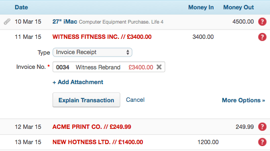
If you go to the Banking section of FreeAgent and explain a bank statement you’ll notice a big change in how this is done. Over the past few months we’ve been completely redesigning the interface for bank reconciliation. It’s a fundamental rework to a key part of FreeAgent and we think it’ll make a huge difference to how quickly you get your books done.
Previously, selecting a transaction in the statement list would take you to a new page (with lots of options!) where you could explain the transaction, before coming back to the statement page. It was a bit tedious, especially if you had lots of simple transactions to explain.
In the new interface, selecting a transaction lets you explain it immediately from the list view, so it’s now it much faster to move through your statement, explaining transactions one at a time.

For most of your transactions you should be able to explain them quickly from the statement page, but you can also select through to the original view via the ‘More Options’ link, if you need any of the other options like project re-billing.
Advanced filtering

Aside from the faster way to explain transactions we’ve also added new filtering options, so it’s possible to filter the list of transactions by status type as well as date range. So you can easily see all unexplained transactions in March or all transactions marked for review in February if you’re using Bank Feeds.
And the list of months displayed in the sidebar now only links to each month’s unexplained transactions. Which is both logical and handy.
Small improvements but ones we think will make a huge difference to your workflow.
But why can’t I…?
You’ll notice that we haven’t added all the explanation functionality to the new interface. Things like project re-billing and using an explanation for matching transactions still reside unblemished in the original screen which you now access with the ‘More Options’ buttons.
We’ve tried to balance making the new interface fast and easy to use while ensuring it’s functional enough to deal with the vast majority of your transactions. Using the almighty twin powers of DATA and SCIENCE we think we’ve struck a sensible balance, but we’re still open to feedback.
Our improvements to the banking area don’t stop here. Over the next few months we’ll be working on more features to help speed up the bank explain process, and we know you’re going to love them.
Now, go forth and explain!
Roan and the team at FreeAgent


