The redesign is live!

Roan Lavery
CEO, Co-founder

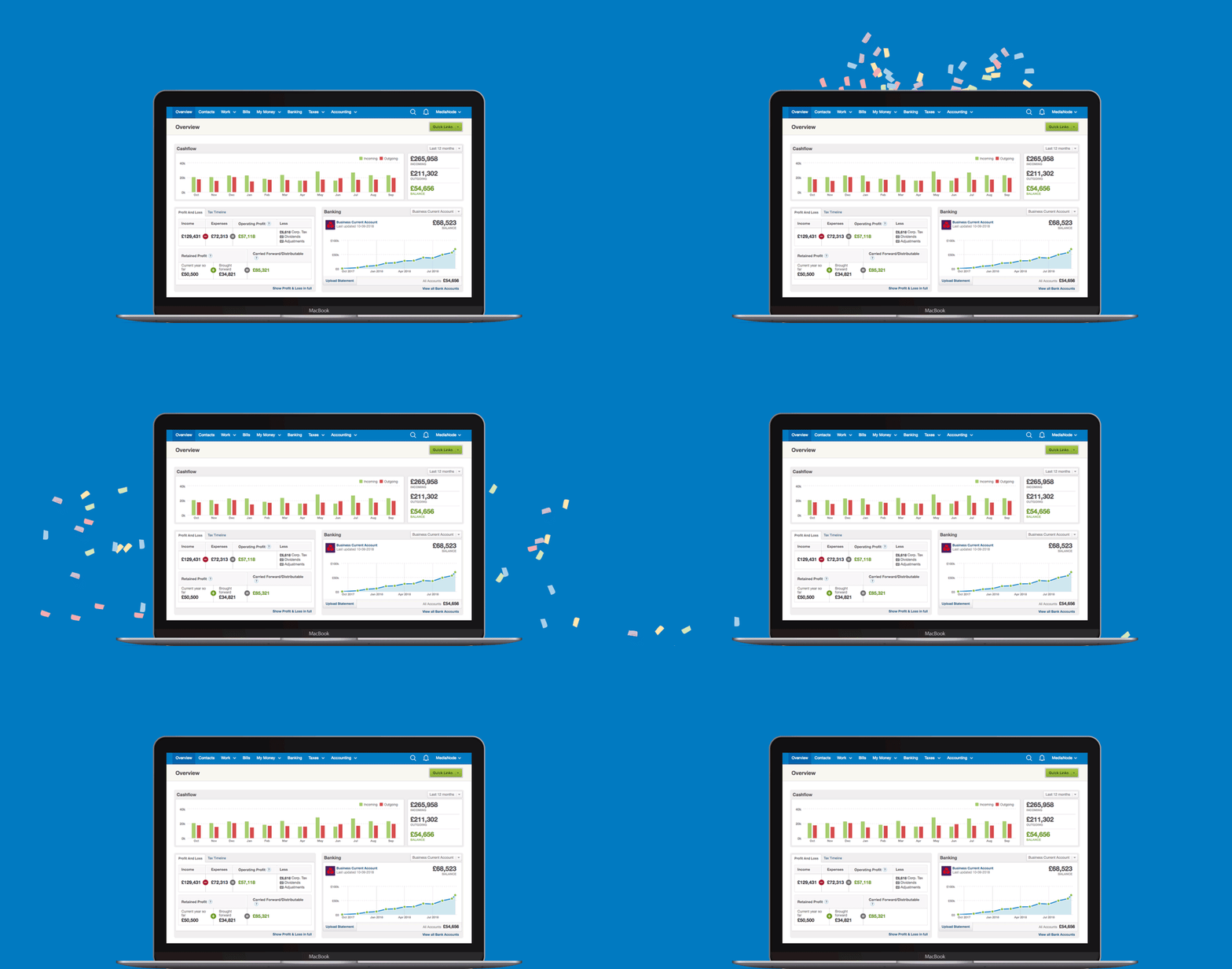
A couple of weeks ago we announced that a user interface redesign was coming soon to FreeAgent. The day has now arrived and if you log in to your account, you’ll see the shiny new header and footer.
As we mentioned a couple of weeks ago, the aim of this redesign wasn’t to radically change the way FreeAgent works - it was more about streamlining and polishing two key parts of the interface: the header and footer.
From the top
The header and navigation area have been trimmed down. The navigation organisation is the same, but it now works better across different devices and screen sizes, and its accessibility has been improved to help people using assistive technology.

New footer and Help widget
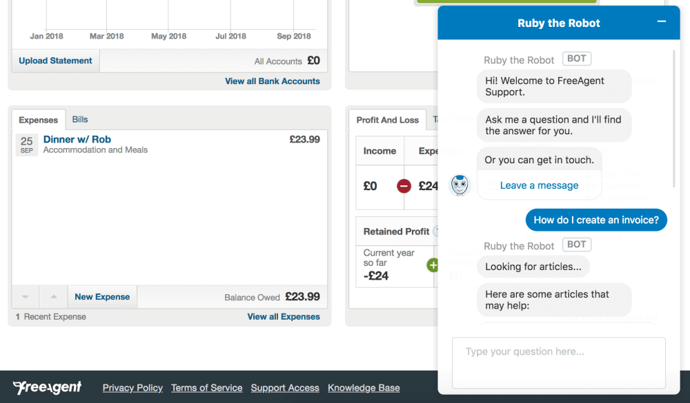
The footer has also slimmed down and we’ve introduced a new Help widget. Powered by Ruby the Robot, the Help widget can access the entire FreeAgent Knowledge Base in an instant. Just ask it any question and Ruby will try to bring back the answers you seek.

What’s next?
What you see today is only the first major step in an ongoing programme of changes to the FreeAgent UI. We’re taking the approach of releasing this in small increments to minimise disruption and launch changes quickly, so stay tuned for more details on what’s coming next. We’ll be blogging openly and recruiting beta testers for early access to more changes.
I just wanted to say a huge thanks to everyone who has taken part in the beta testing so far. Your feedback and help has been invaluable in helping us refine the new UI.
Until next time
Roan and the team at FreeAgent


